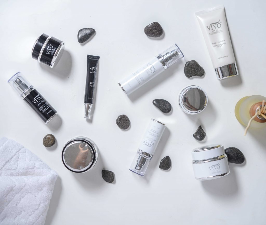
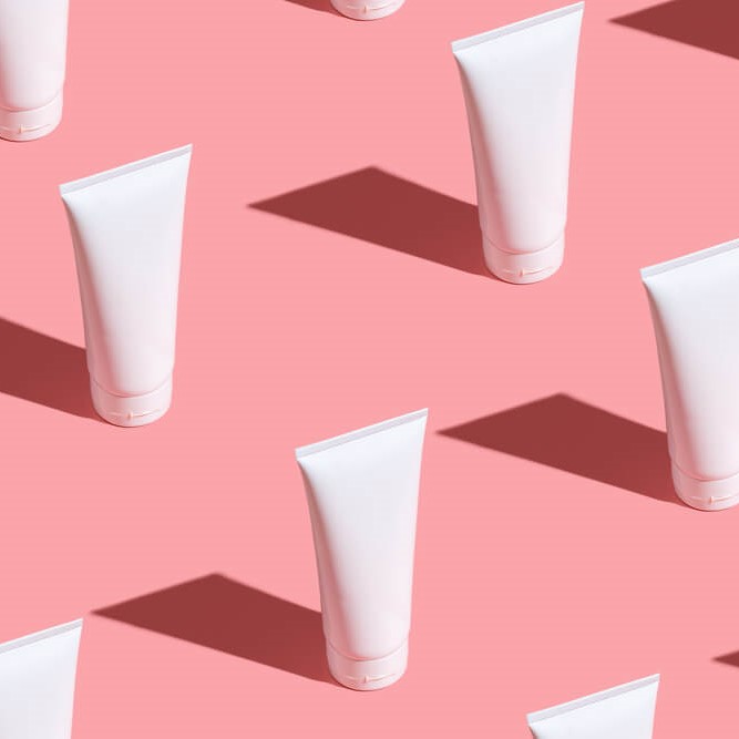
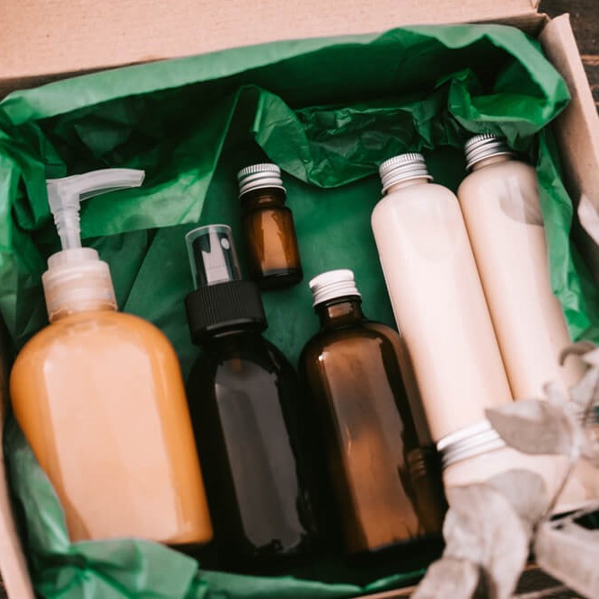
In recent years, skincare products have become the ultimate symbol of self-care and me-time. Sure, their main purpose is to take care of your skin’s overall health. But they also exist to make people happy and excited to walk into their bathroom and look at their skincare shelf. For that, we have gorgeous packaging and skincare label design to thank.
Your skincare label design is important for many reasons. For one, it’s the first thing people notice about your products — way before they even know what you stand for as a brand and what ingredients each formula has. It’s basically your skincare brand’s first impression, so nailing it matters a lot.
But how do you perfect your skincare label design? Where do you start? What research needs to be done? How do you know what colors, fonts, and visual elements to use?
Well, welcome to skincare label design 101! Today, FLPL will be talking about everything you need to know to come up with the best skincare label design for your brand.
Why is Good Skincare Label Design Important?
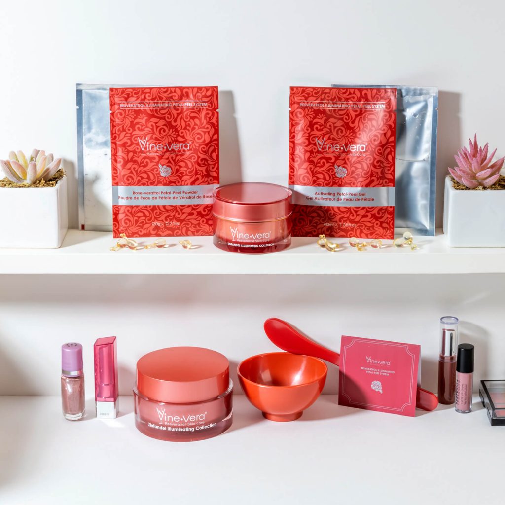
If there’s any type of product that you can count on to have gorgeous packaging, it’s skincare and beauty. And it only makes sense — beauty products should reflect the glamour and aesthetic their entire industry represents. So when it comes to skincare, enticing label designs reel in more sales.
How your skincare label design looks matters a lot, and not just because it’s the first thing people see when looking through your product line-up. Skincare is a saturated market, so you need to stand out. Only the most creative and well-thought-out skincare label design can do that.
Another reason it’s important is because of the rise of skincare “shelfies” — aka the trend of taking Intagrammable photos of your skincare shelf. This trend has paved the way for skincare that isn’t just effective, but is beautiful to look at as well.
When private labeling your skincare products with FLPL, you have full control of how you want your skincare label design to look, but with the help of our expert art and marketing team to help you bring it to life.
We’ll help you come up with the best, most marketable skincare label design, from the color palette to what’s written on your packaging. We’ve led so many high-end skincare brands to striking, winning skincare label designs that have landed them a coveted spot on people’s “shelfies,” and we can do the same for yours.
Ready to come up with your own skincare label design? Here are nine of the most basic things you need to know when creating yours!
1. Know Your Target Market Inside and Out
The first thing you need to have down pat is who your target customer is. Any business owner or designer knows that having a clear consumer demographic and psychographics is the backbone of any label design project. Here’s why.
It’s important to know who you’re trying to attract with your products. Why? Because that’s how you’ll come up with all the elements you should use for your final skincare label design. After all, you wouldn’t have a pink, glittery design for men’s grooming products, would you?
So, make sure you know exactly who it is you’re trying to attract. Think about age, sex, life stage, career, and even their mindset and values.
Do research on the skincare and beauty trends they follow. Do moms appreciate minimalist designs? Is Millennial pink still a thing? This will allow you to draw inspiration from their likes and dislikes aesthetic-wise later on.
2. Have Visual Elements That Reflect Your Brand Personality
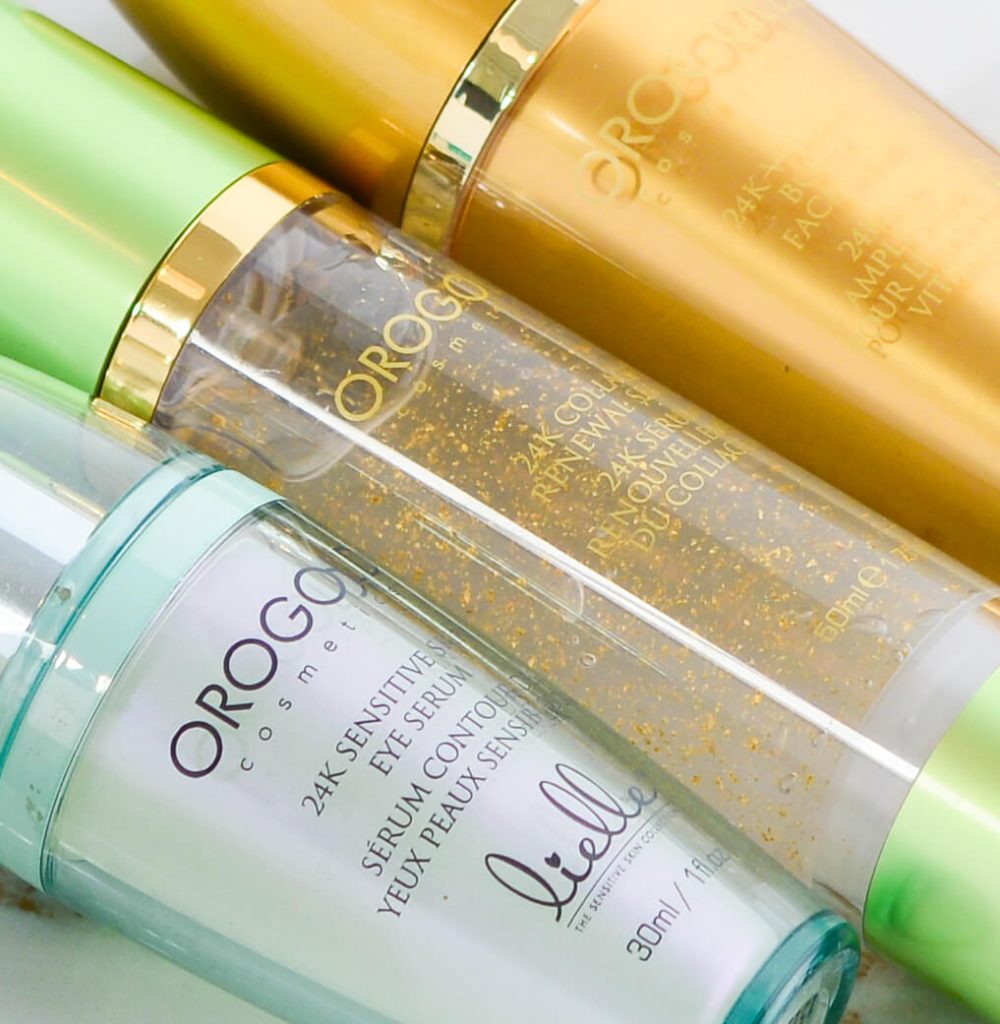
Aside from knowing as much as you can about your target market, it’s also important to be an expert on your own brand identity. The last thing you want is to come up with a skincare label design that, while eye-catching, isn’t aligned with how your brand presents itself.
Your label’s key design elements need to reflect who you are as a skincare brand. If your brand is clean and simple, try to go for minimalist designs, which work for younger and more sophisticated audiences. If you want your brand to come off as strong, daring, and confident, you can play around with the complete opposite: maximalism, which uses dramatic visuals and colors that pop.
Are you opulent and aspirational (look into golds and minimalist logos), or more youthful and vibrant (think vector art and neon colors)? Whatever your brand identity is, your skincare label design needs to match it.
Your label design also needs to be aligned with whatever you’re selling. For example, if you’re designing packaging for a vitamin C serum known for brightening, the label design should be lively and invigorating. Think about bright orange hues and maybe tiny doodles of orange slices.
And if you specialize in CBD-infused skincare that is soothing and au natural, make use of that unmistakable, oh-so-familiar cannabis leaf as a visual element, as well as earthy colors.
3. Use Colors and Typography That Will Attract Your Intended Audience
Two pertinent design elements you need to decide on for your label will be colors and typography style. Both (individually and together) will dictate the vibe you give off from your skincare label. So, make sure you choose the right ones.
Let’s start with color. Colors are a great way to evoke emotion in your customers. That’s why most labels have a distinct color palette. But don’t just choose any color. Look for shades and hues that align with your brand’s overall vibe.
If you’re an organic skincare brand that uses natural ingredients only, try to go for green — the color of earth and nature that is associated with growth and freshness. If you’re a sophisticated brand for women, try out feminine hues, like baby pink or neutral beige.
Then there’s typography. Fonts are a great way to express yourself as a brand. If you’re a fun, quirky brand, you can use hand-lettered calligraphy on your design label. If you’re a chic, fuss-free brand, sleek text will work best.
Your audience will also dictate what kind of typography you’ll want to use on your skincare design label. Older audiences usually need big fonts to help them easily read what’s on your label. Meanwhile, younger audiences might appreciate the clean look of smaller text better.
4. Think About Your Unique Selling Proposition
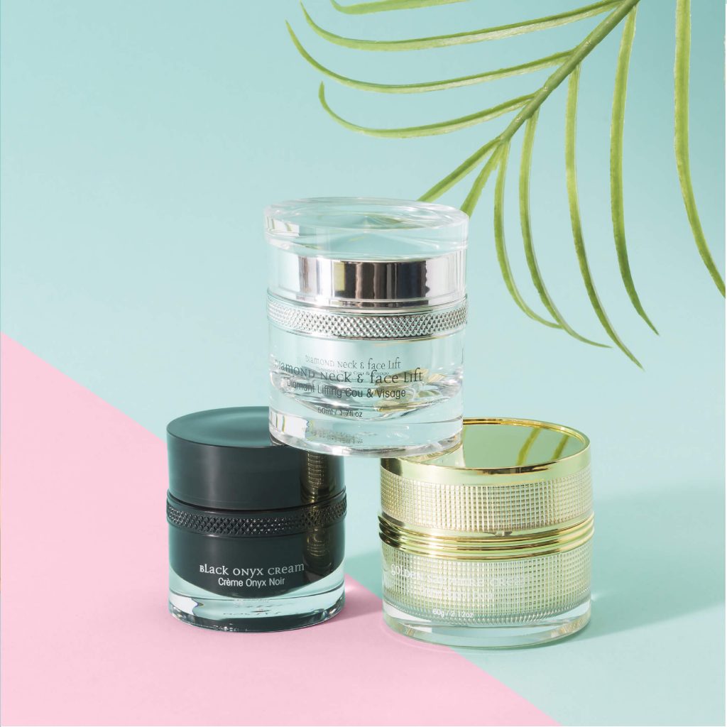
But don’t go thinking that your skincare label design should be all about aesthetic design. You still have to be marketing savvy too. That’s why you always need to make sure your unique selling proposition — aka the feature or benefit of your product that gives you an edge — is visible in your label design.
Your USP can be anything from a key ingredient that makes you stand out or an effect on the skin that will blow your customers away. Then, you need to show it somewhere on your label, whether it’s through your logos and patterns or as a subheading under the product name.
For example, if you have a night cream formulated with ingredients that diminish the appearance of wrinkles, make sure the phrase “anti-aging” is visible on your label.
Your goal is to grab your customers’ attention by letting them know why they should buy your product, and what they’ll get out of it.
5. Communicate What Your Ingredients Can Do…
Speaking of talking about what’s unique in your product, don’t forget to communicate your ingredients too.
Today, Gen Z and Millennial skincare lovers are skintellectuals (in other words, very educated about beauty ingredients and what they do). They know ingredients inside and out. Gone are the days when everyone will clamor to your product just because you tell them it will make their skin look younger. Now, it’s all about proving it by telling them what ingredients you have.
So, if you have ingredients like niacinamide or hyaluronic acid, make sure to mention it somewhere in your skincare label design.
At FLPL, we have an extensive ingredient catalog that describes what every powerhouse ingredient does for the skin. This will be a huge help in talking about your ingredients in the label design.
6. …But Make Sure Not to Overwhelm Your Audience
But while you want to inform your customer about what’s in your product and what it can do for their skin, be sure not to overwhelm them. The less text on your product, the better.
Don’t make your descriptions too wordy, because all that will do is make customers — especially skincare beginners — confused and panicked. As much as possible, be straight to the point and keep it as simple as possible.
For example, imagine you’re selling lip balm. This is a pretty self-explanatory product — everyone knows it’s for moisturizing your lips. So, don’t go into detail about how each and every ingredient works to condition, exfoliate, and plump up your lips. Just do a quick and easily digestible slogan that says “For softer lips!”
7. Tell Your Customer How to Use Your Product
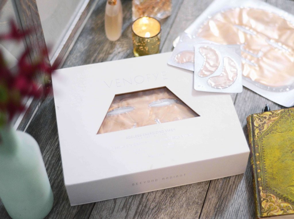
Never assume that your customer will know how to use your product right off the bat. Always hold their hand through it by writing down clear directions on the label itself. Make it foolproof.
This is important because it’s how you can make sure your customers are a) using the product properly to reap all the benefits, and b) being safe while doing so. One wrong move, and they could be irritating their skin.
Your label also needs to show dosing and frequency of use. Is this an everyday product or a once-a-week kind of thing? You also need to specify how to store the product, especially if the formula is sensitive to light and oxidation. That way, they can extend the lifespan of your skincare product.
8. Have a Cohesive Look for Products That are Under the Same Collection
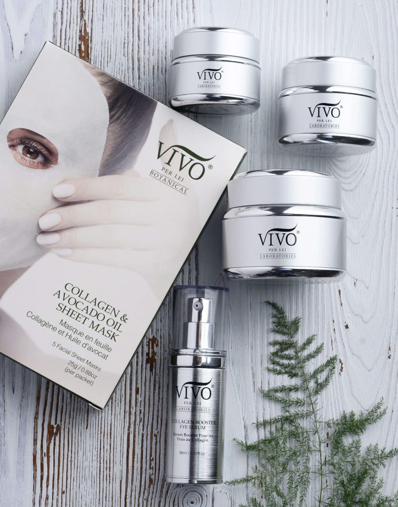
It can be a hassle if skincare products from the same line don’t have anything in common in terms of design labels. If your customer is buying from a specific line under your brand, make it easier for them by using the same visual elements across all products in that line.
Let’s say you have two collections — one for oily skin and another for dry skin. It would be super confusing if every single product from each line had different colored packaging. Shopping for a routine will be easier if you have one look and feel for the entire collection, i.e. all pinks for oily skin products, all whites for dry skin, and so on.
Your customers will thank you for this later on as well when they place all their products on the shelf. When the look is cohesive and tied together well, they’ll look super pretty and Instagrammable in the bathroom — perfect for a “shelfie” post!
9. Adjust Your Label Design as You Deem Fit
Lastly, make sure you have the flexibility of changing up your skincare design label when it’s not exactly as big a hit you thought it would be with your customers. If sales aren’t booming and you’ve gotten feedback about packaging that isn’t so appealing, change it up!
That’s the beauty of working with a private label partner like FLPL. We can help you adjust your skincare label design; just say the word. Plus, we have a team of marketing consultants ready to help you decide on what type of changes you should make to improve your business.
Conclusion
Designing your skincare label can be lots of fun and is a great way to bring out your creative side when launching a business. But it’s about more than just what looks cute and trendy.
Your skincare label design must be practical, informational, and exciting for your intended audience too. It should be helpful to your customers while still looking polished and on-brand. That’s how you get on your customers’ skincare “shelfies”!
Overwhelmed by all the steps listed above? Let FLPL put it simply: to achieve the best and most attractive skincare label design, all you have to do is know what your brand stands for and what gets your target market excited. As long as you understand those, the design elements will follow.
Want to take your skincare brand further with some exquisite new products? Check out FLPL’s range here.

